
Cover Purchases
A fresh update to a popular feature

"Cover Purchases" is one of the most widely used methods for users to redeem their rewards, allowing users to retroactively "erase" specific purchases after they have been made.
Our recent updates have streamlined the process, ensuring a frictionless and accessible experience for all users.
Overview
Team:
Capital One Small Business Rewards
(with impacts to Capital One Consumer Rewards)
Project Details
Project Type:
UX Design
Role:
Design Lead (Main designer on the project)
Platform:
Web for Desktop, Tablet & Mobile
Native App for iOS & Android
Tools:
Figma
Design Timeline & Release:
August 2022 - September 2022
Part 1 Released on Web September 2023
Part 2 Released on Web September 2024
All Changes Released on Mobile February 2025
Using your rewards to pay yourself or your business for a specific purchase can make it feel like you didn’t actually spend real money—perfect for a guilt-free splurge or fun treat. The Capital One "Cover Purchases" redemption for cash cards and "Cover Travel Purchases" for travel cards let users do exactly that. As one of our most popular redemption options, it was time for some updates to give it a fresh, modern touch. This project made it more user-friendly, aligned it with our current design systems, and, importantly, enhanced its accessibility.
Project Description
Interested in learning more? Scroll down to discover how the updates have enhanced our users' redemption experience, along with the process I took to bring these improvements to life!
Design Process
A popular feature needs an update
Our Cover Purchases redemption methods are some of the most popular ways to redeem rewards. Yet, it hasn't been updated in six years, leading to an outdated user interface causing unnecessary customer friction, looking out of date with our current design system, and worst of all, causing difficulties for users needing to use accessibility tools such as screen readers.
Given these issues and its popularity, especially with Small Business card holders, it was time to refresh Cover Purchases.


Original versions of the Cover Purchases redemption method (Android & Web)
As I wasn't the original designer of the various Cover Purchases, I analyzed the original designs and reviewed documentation relating to the customer journey and design decisions. I aimed to get a better understanding of how it compared to our current design system and what accessibility issues were flagged.
Based on accessibility reports and the review, I had four main priorities:
Ensure the date was not the selector as it caused problems for users using screen readers
Use our current design system, specifically updating colors and improving color contrast
Fix micro-interactions that cause inconsistent alignment and require user recall
Ensure customers didn’t have to repeat the process for each transaction they wanted to erase, one at a time, as ~60% of our customers would redeem multiple transactions in the same log in session
Scoping out the work


Image 1: The date is no longer visible when a user selects the transaction.
Image 2: The blue used is no longer part of the design system.
Image 3: The error message is not associated with where the error is occurring.
Making our designs more accessible
First and foremost, my priority was to make sure our designs were as accessible as possible. Our biggest changes included:
Instead of having users select the date to choose a transaction and therefore removing that data from the screen, we added a true selector that made it intuitive for all users.
By moving the main error message from the bottom of the screen to where the error was occurring, it helped screen readers (and all users) better understand where the error was.
Ensuring that all text met the 4.5:1 color contrast ratio and 3:1 for icons.
While improving accessibility, these changes helped inform what our UI modernization would look like, positively impacting all our customers.
The error message is now in the transaction row, keeping it close to where the error occurs
Users click on the check box to select a row, keeping the date visible
Modernizing the UI
Next, I wanted our feature to reduce user friction when redeeming their rewards while better presenting information for faster comprehension by:
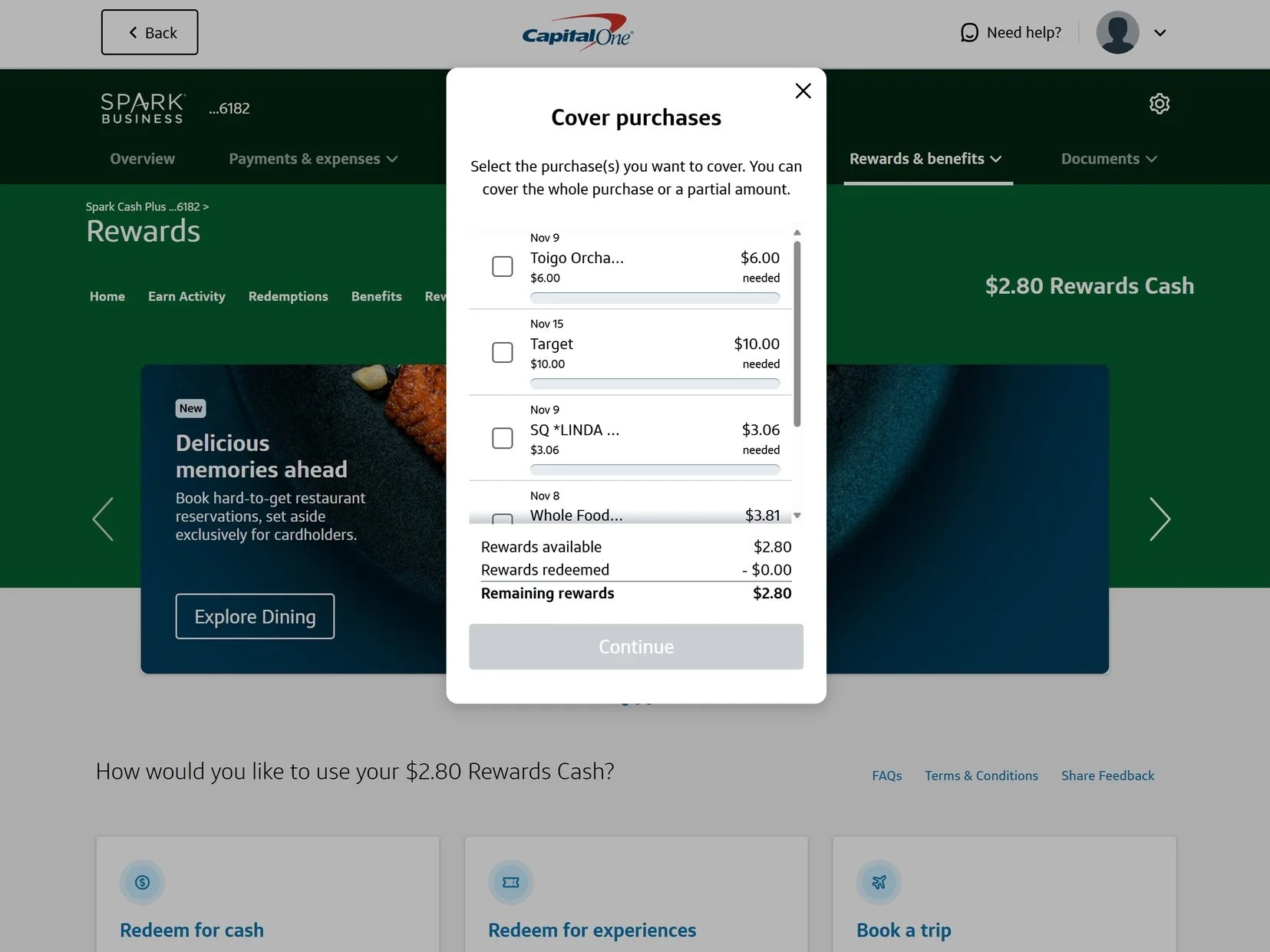
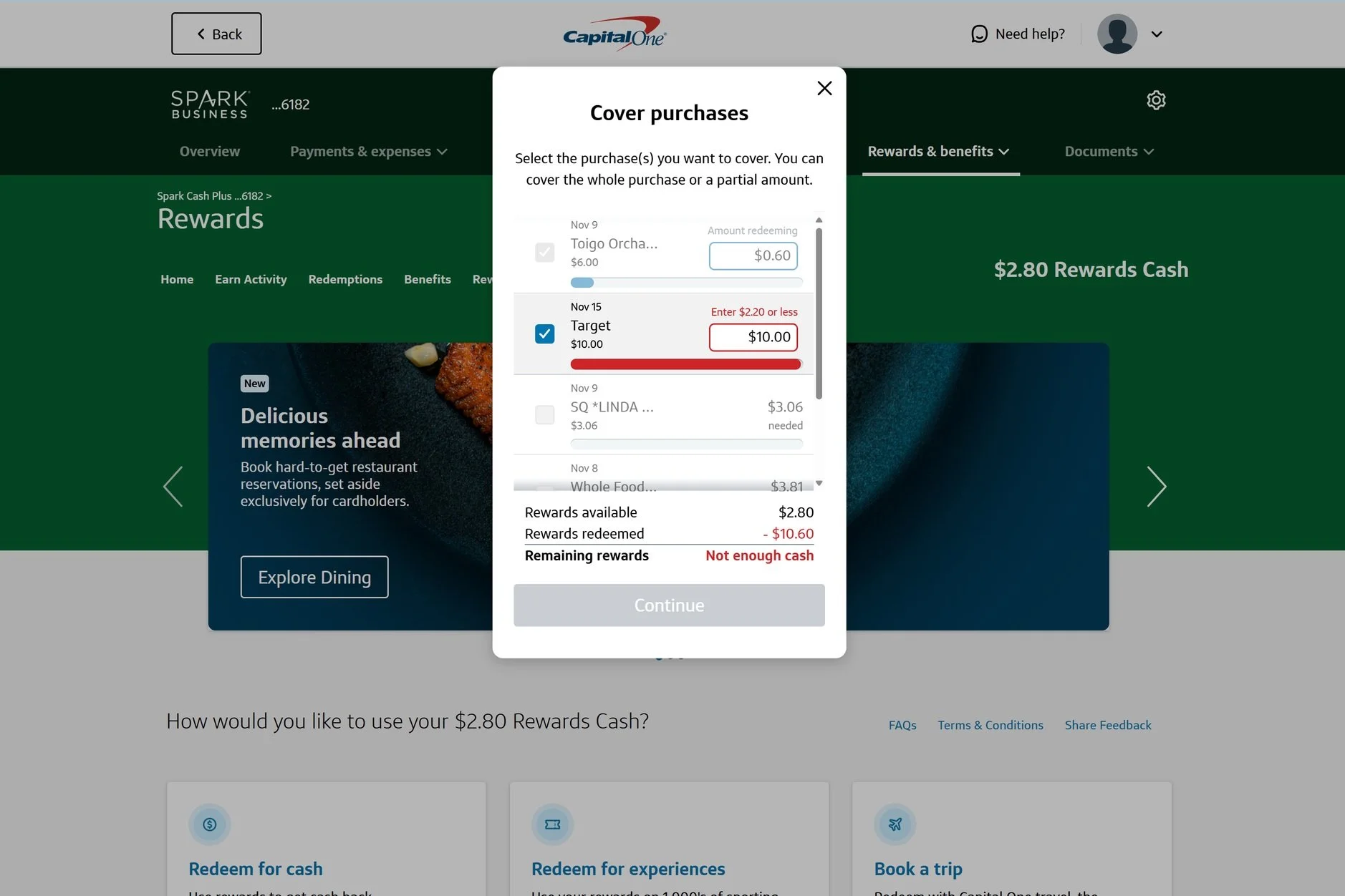
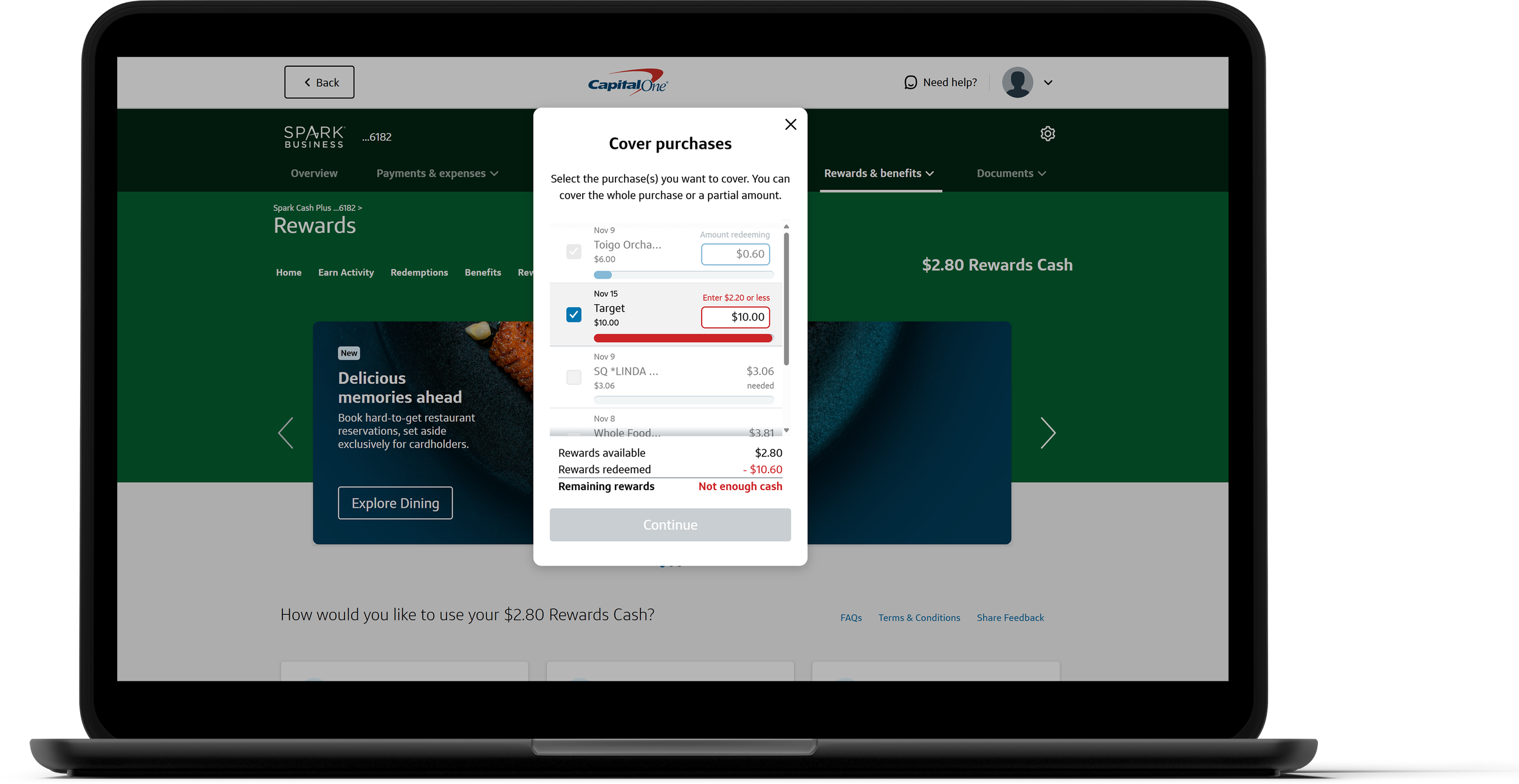
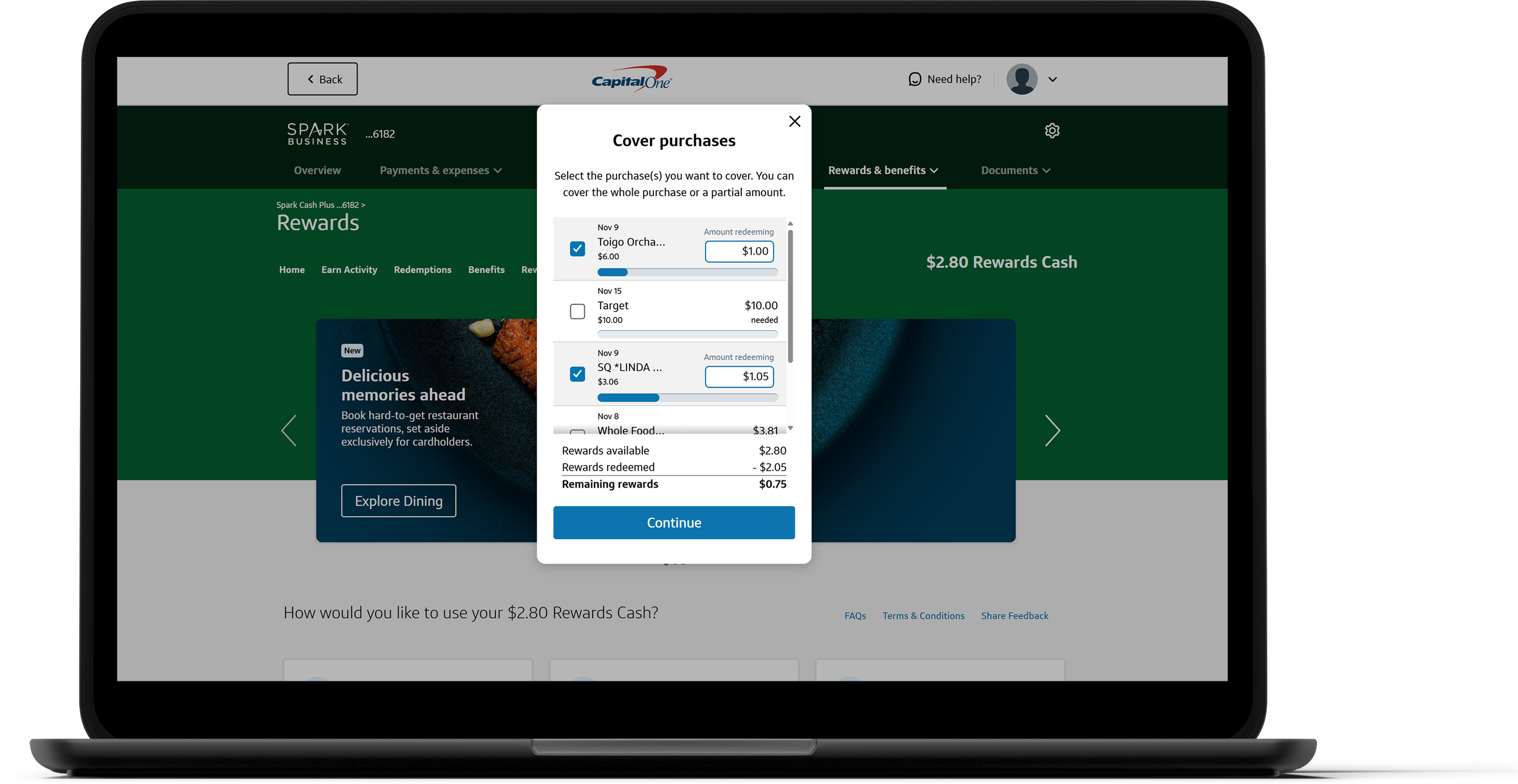
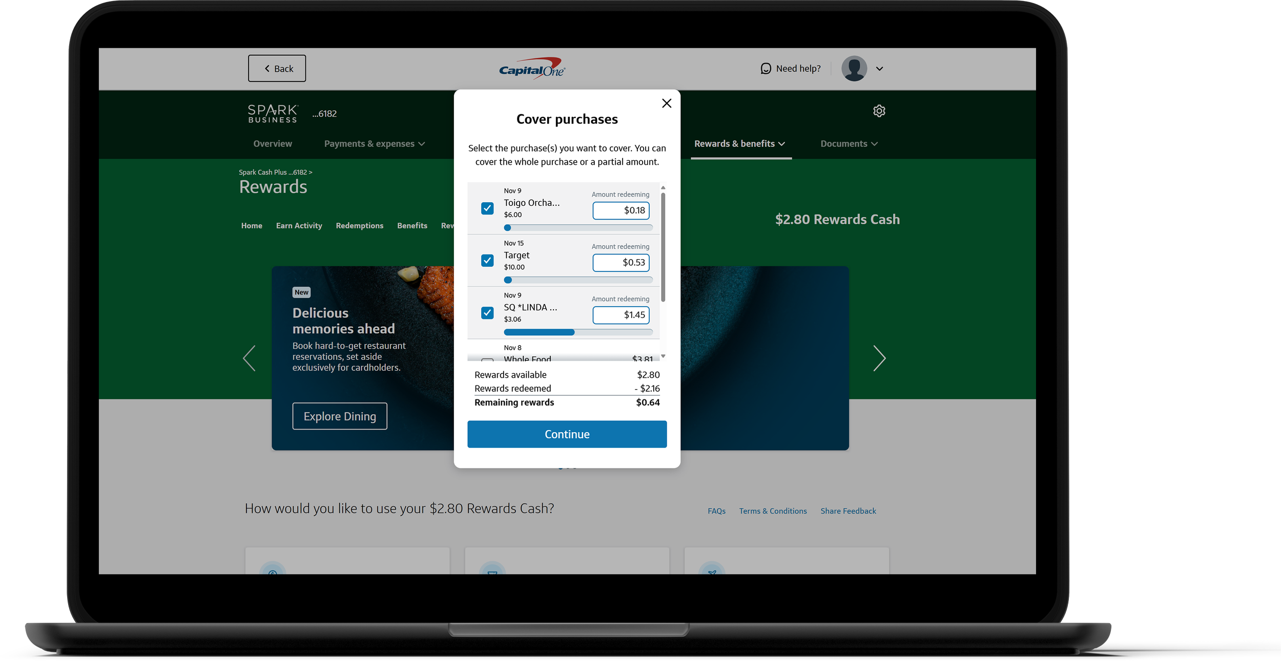
Allowing users to select multiple purchases to cover in a single session
Consolidating the available and remaining rewards in a transaction table (and adding rewards redeemed) to have users quickly understand how this transaction impacts their rewards balance now that users have to keep track of multiple selected purchases.
Re-designing the transaction row to include the date above the retailer and using the space on the right to include additional data so users can better understand previous and current redemptions.
Updating the content to match our current tone and voice.

After selecting 1 or more transactions, the table at the bottom provides a glance at how redeeming affects your rewards.
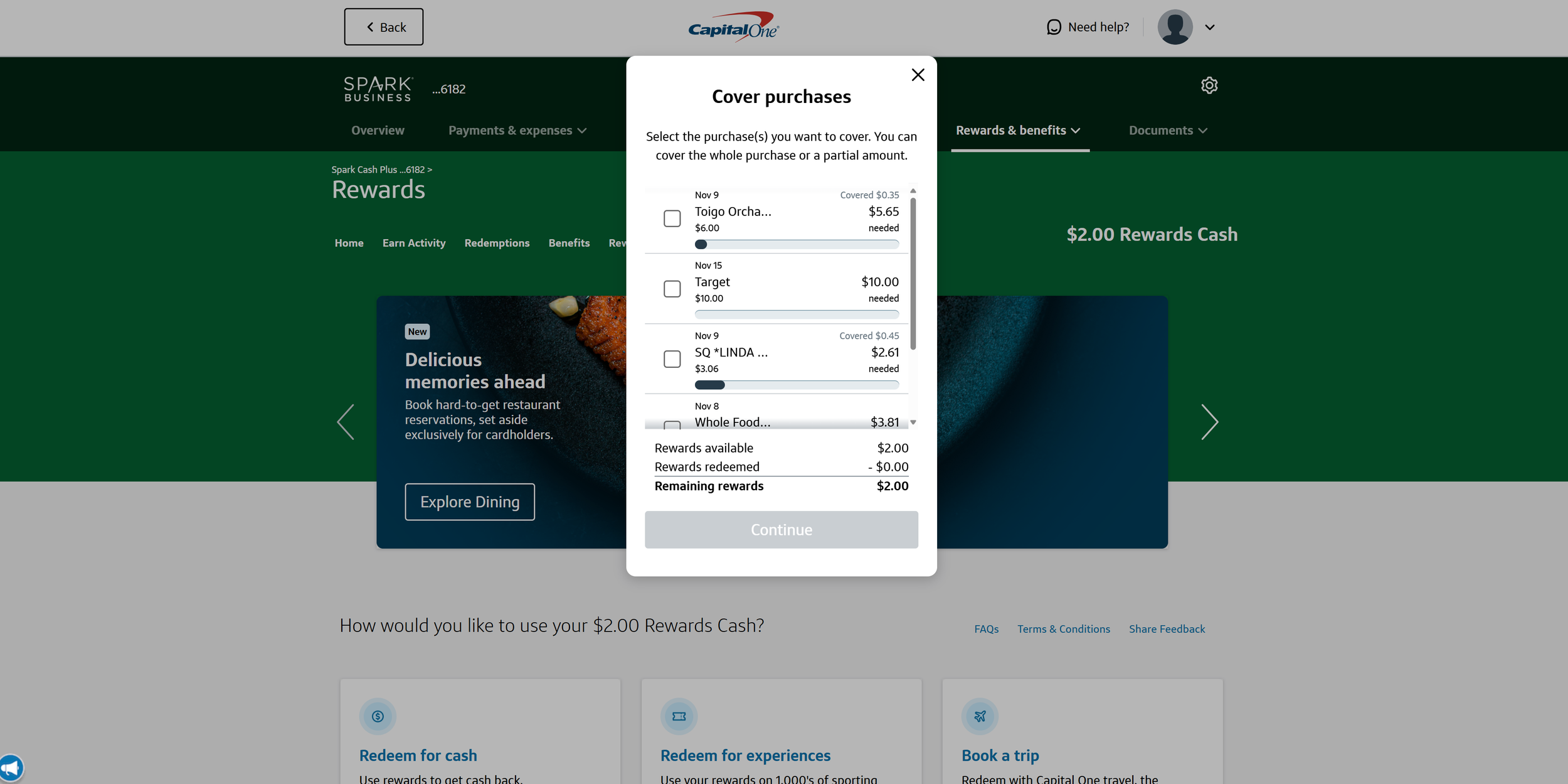
If you previously redeemed part of this purchase, you can see how much you got back already.
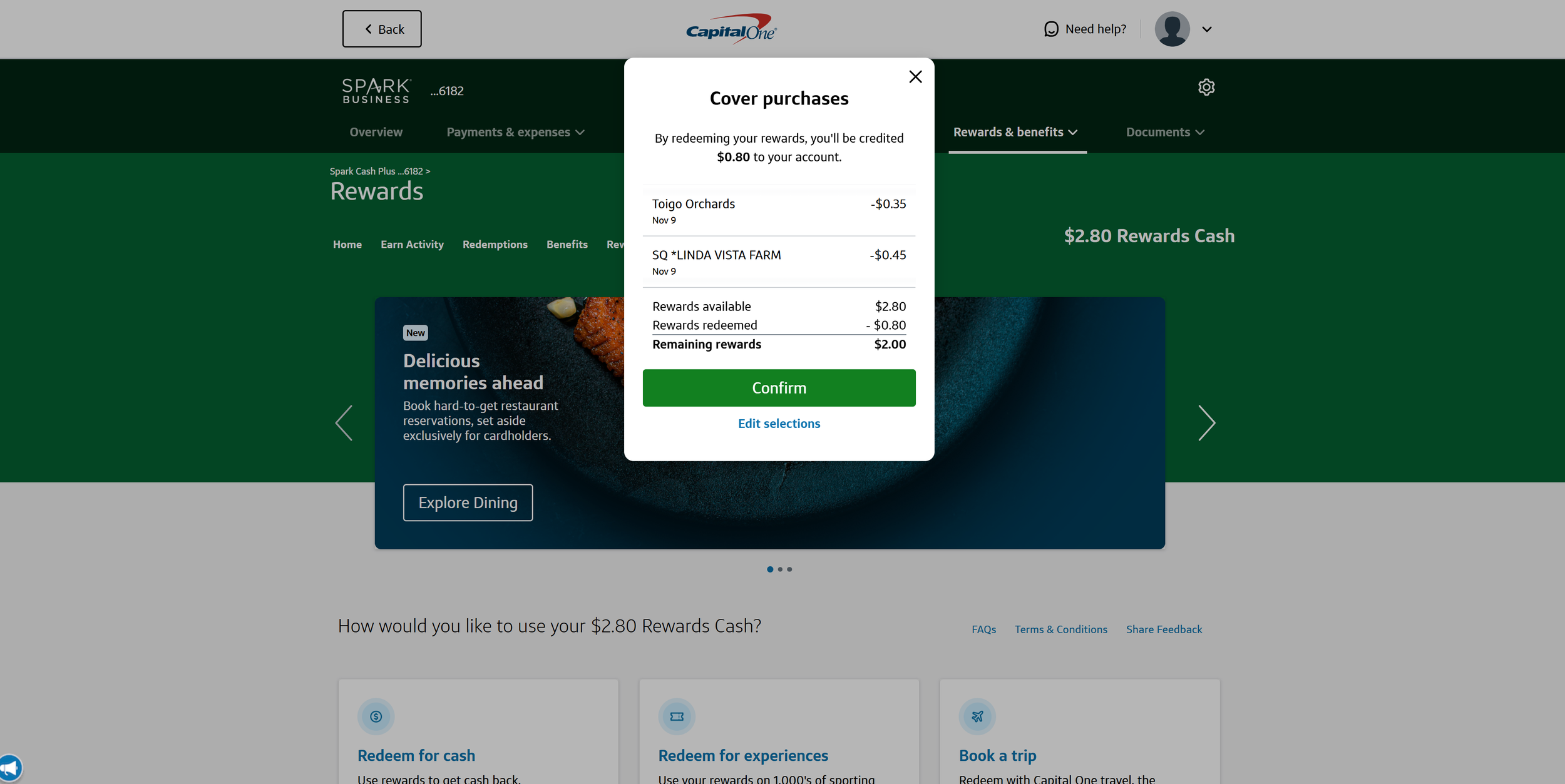
The subtext on the success page lets users know what to expect in more detail.
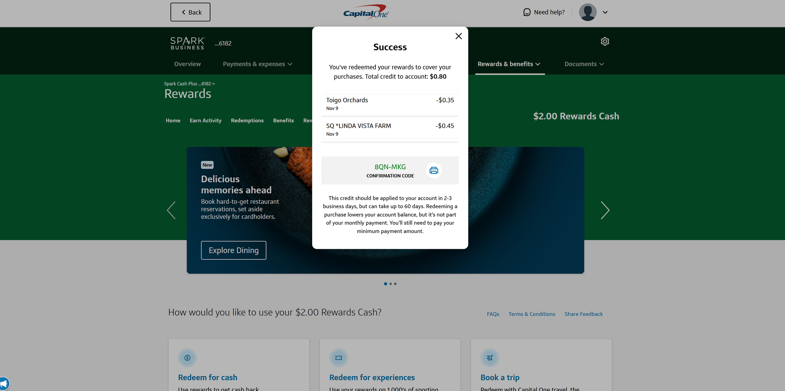
The confirmation page matches our tone and reaffirms the selection the user made.

The error message above the error lets a user know how to fix it.
Throughout the process, I held weekly meetings with my product partners for both sides to provide updates and ask any questions they had to make sure we were all aligned. I also shared my designs in critique sessions to get feedback from other designers.
Once the designs were complete, I ensured that all the designs were componentized for our central library and had proper auto-layout. The designs then went through our Experience Design review process, checking to make sure it aligned with Capital One standards and met all accessibility requirements.
Post-design reviews

Developer handoff & build questions
As I got ready to handoff my designs for development, I made sure to create detailed annotations and held a few meetings to go over the designs with the developers live and understand what documentation would be helpful for them.
Throughout the process, I emphasized open communication with my tech team and made sure they felt comfortable asking me any questions they had about the designs. This enabled us to problem solve quickly to ensure the development could keep going. Our communication became critical as we learned about new constraints and a few mismatches between what was in the original designs and what was in production at the moment.
Some unforeseen challenges
Development is never a perfect process. Beyond the mismatches, some other challenges that impacted our original development timeline.
One major roadblock that we faced was that while the web development was going well, the mobile team was facing some major roadblocks and capacity constraints. Due to this roadblock, product, design, and tech got together and made the decision to only release the updates to web, with mobile app updates to come sometime in the future.
In mid-2023, we had to make the hard decision to split the web release into 2 parts. Due to technical difficulties and bandwidth of supporting tech teams, the ability to enable customers to redeem multiple purchases at once would delay the launch of this feature into late 2024. After some discussion, we recognized that the accessibility updates were a major priority for us, and we didn't want those updates to be delayed while we worked on the multi-select capabilities.
Design QA
After various delays and challenges the team overcame, I was excited to design QA the build! This essential step helped ensure the customer experience going to production matched the experience I envisioned. Given our challenges, not everything was going to be the same, but through our constant communication, we were able to deliver an experience that got as close as technically feasible. In QA, we discovered some minor errors related to spacing and text, but those were quickly corrected, and we were able to release!
New changes to a beloved feature
Main changes
Accessibility Updates
Ensuring our features are accessible and intuitive for all users is always our priority. Updating Cover Purchases to enhance usability was crucial. By consistently displaying all relevant information and positioning error messages directly next to the issue, we’ve made it easier for assistive devices to interpret the content, significantly improving the overall user experience.
Covering Multiple Purchases
Our updated, user-friendly design allows customers to cover multiple purchases at once, reducing redemption time and boosting overall efficiency. For over 60% of Small Business customers, this means a faster, more satisfying experience that makes redeeming rewards simpler and more convenient. This change was only released to Small Business customers.
Transaction Table
The transaction table provides users with a clear, comprehensive view of their rewards usage, displaying the total of all selected purchases in one convenient place that reduces the need for mental math & risk of errors. This empowers the user to make the right decision for their account with confidence. It also uses a familiar pattern for many people, especially small business owners.
Cover your purchases!

Have a Capital One credit card? Cover one (or more!) of your purchases and experience the entire process in real-time, directly on your account!
Reflection
This was the first project I led from start to launch, giving me valuable experience not only on the design side of the work, but also on how to better influence decisions as well as communicate and partner with the developers on the tech team building my designs. Working to understand the needs of my tech team let me tailor the documentation to their needs, ensuring a smooth handoff experience.
This project also taught me how to be flexible, proactive, and influential. There were a lot of bumps along the way and a part of my growth as a designer was navigating those ups and downs. Whether it was the fact that some of our design components weren't available yet on the developer side or that there were too many back-end complications to launch the mobile designs, these conversations and moments improved my ability as a designer. This led to a better understanding of other parts of the business and how different parts of the company come together to launch a new feature.